Categories
Technology

Blazor Performance Optimization: Lazy Loading Guide

Blazor is a powerful framework for building interactive web applications using .NET. As applications grow in size and complexity, performance optimization becomes crucial. One effective technique to enhance performance is lazy loading. In this blog post, we will explore lazy loading in Blazor and understand how it can improve the loading speed and responsiveness of your applications.

What is Lazy Loading? 

Lazy loading is a technique that defers the loading of certain resources or components until they are actually needed. Instead of loading everything upfront, lazy loading allows you to load specific parts of your application on-demand, reducing the initial load time and improving overall performance.

Benefits of Lazy Loading in Blazor

  1. Faster Initial Load: By loading only the essential components and resources during the initial page load, lazy loading minimizes the amount of data transferred, resulting in faster load times.
  2. Reduced Bandwidth Usage: Lazy loading helps conserve bandwidth by fetching additional components or data only when they are required. This is particularly beneficial for mobile users or those on slower network connections.
  3. Improved User Experience: With lazy loading, users can start interacting with the application sooner, as they don’t have to wait for the entire application to load. This improves the perceived performance and provides a more responsive user experience.

Implementing Lazy Loading in Blazor

To implement lazy loading in Blazor, we can leverage the dynamic component loading feature introduced in Blazor .NET 6.

  1. Identify the Components to Lazy Load: Analyze your application and identify components that are not immediately necessary on the initial page load. Examples may include complex data grids, charts, or sections of the application that are accessed less frequently.
  2. Create Placeholder Components: For the components that will be lazily loaded, create lightweight placeholder components that are initially rendered in their place. These placeholders can be simple loading spinners or placeholders with minimal content.
  3. Load Components On-Demand: When the user triggers an action or navigates to a section requiring a lazily loaded component, dynamically load the actual component and replace the placeholder. This can be done using mechanisms like RenderFragment or by utilizing third-party libraries such as Blazor.Lazy.
  4. Manage State and Data Dependencies: Consider any state or data dependencies of the lazily loaded components. Ensure that the necessary data is available and propagated to the components when they are loaded.
  5. Graceful Error Handling: Handle any errors that may occur during the lazy loading process, such as network failures or component loading failures. Provide informative error messages or fallback options to prevent a poor user experience.

Sample Lazy loading

Here are a few code snippets to illustrate the implementation of lazy loading in Blazor

1. Placeholder Component 

lazy loading in Blazor example 1

2. Lazily Loaded Component

lazy loading in Blazor example 2

3. Lazy Loading in Parent Component: 

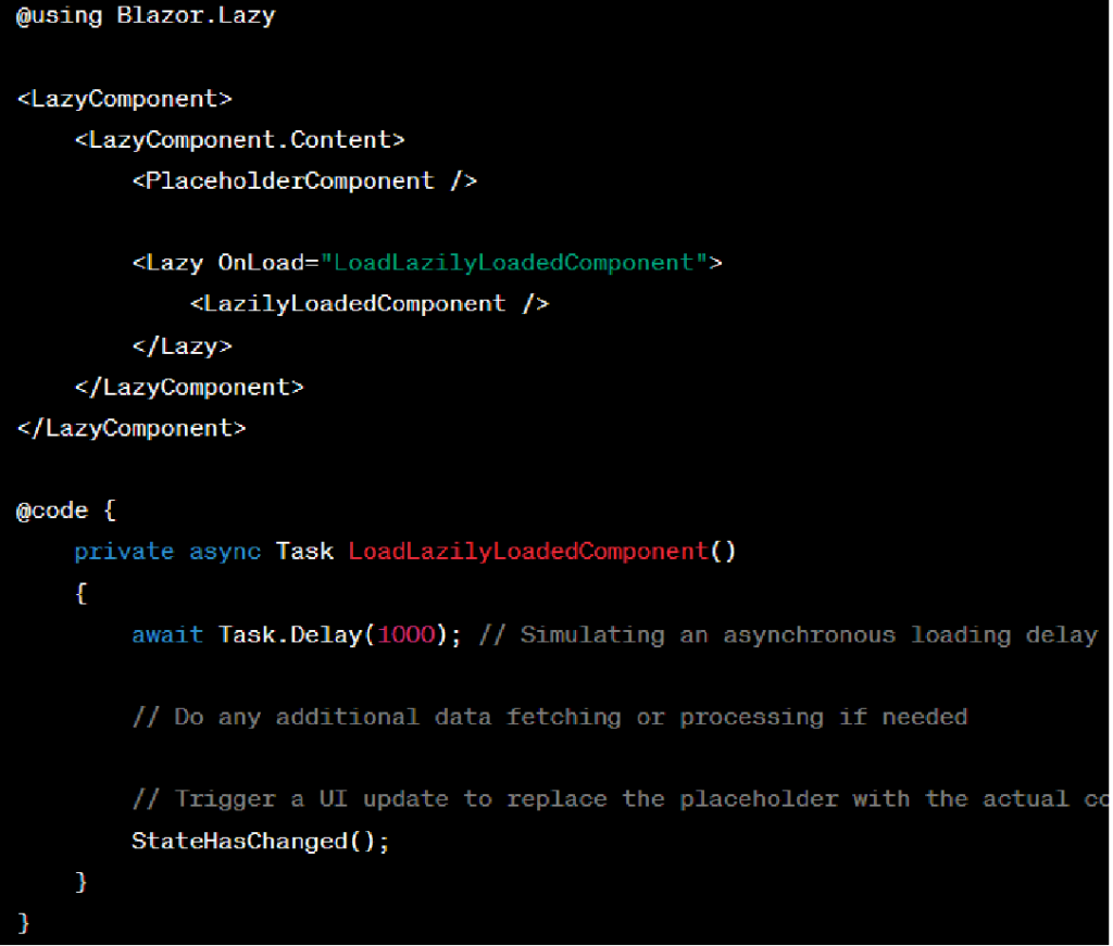
lazy loading in Blazor example 3

In the example above, the PlaceholderComponent serves as a lightweight component initially rendered in place of the LazilyLoadedComponent. The LazyComponent from the Blazor.Lazy library is used to encapsulate the lazy loading functionality. When the LoadLazilyLoadedComponent method is invoked, it simulates an asynchronous loading delay and then replaces the placeholder with the actual LazilyLoadedComponent.

Remember to include the necessary using statements and reference any required libraries in your Blazor project to utilize lazy loading functionality.

These code snippets provide a basic implementation of lazy loading in Blazor. You can further enhance and customize the implementation based on your specific requirements and application structure.

The code snippet provided uses the Blazor.Lazy library as an example. Make sure to install the library via NuGet or use an alternative lazy loading solution if desired 

Conclusion: 

Lazy loading is a powerful technique in Blazor to optimize performance by deferring the loading of non-critical components and resources until they are needed. By reducing the initial load time and conserving bandwidth, lazy loading can significantly enhance the user experience of your Blazor applications. Remember to identify the right components to lazy load, create placeholders, and load components on-demand while considering state management and error handling.

By adopting lazy loading techniques in your Blazor applications, you can deliver fast, responsive, and highly performant web experiences. So, why wait? Start leveraging lazy loading in Blazor today and take your application performance to the next level!

Additionally, if you want to explore more about the topic, you can check out the informative blog post titled “Creating Static Images in Blazor: A Complete Guide” for further insights and guidance.

Categories
Technology

Creating Static Images in Blazor: A Complete Guide

Blazor is a popular web framework that allows developers to create web applications using C# instead of JavaScript. It provides a simple, elegant, and efficient way to build client-side applications that run in any modern web browser. In this article, we will be exploring the creation of static images in Blazor. We will cover the basics of how to add and display images in a Blazor application, as well as some advanced techniques for optimizing images for better performance.

Understanding Image Formats

Before we dive into the specifics of creating static images in Blazor, it is important to understand the different image formats available and their respective advantages and disadvantages. There are three primary image formats used on the web: JPEG, PNG, and GIF.

JPEG is a lossy image format that is best suited for photographs and other complex images with many colors. It is a compressed image format that reduces file size by removing some of the image’s original data. While this compression can result in a loss of image quality, it can also greatly reduce file size, making it ideal for use on the web.

PNG is a lossless image format that is best suited for images with fewer colors, such as logos, icons, and other graphics. Unlike JPEG, PNG compression does not remove any image data, resulting in higher image quality but larger file sizes.

GIF is a lossless image format that supports animation. It is best suited for simple animations and other small, lightweight graphics.

Adding Images to a Blazor Application

Adding images to a Blazor application is a straightforward process. First, you need to include the image file in your project’s wwwroot folder. This folder is used to store static files that can be served directly by the web server.

Once you have added the image file to your project, you can reference it in your HTML or Razor code using the  tag. For example, the following code displays an image named “logo.png” in a Blazor component:

<img src=”/logo.png” alt=”My Logo” />

In this code, the “src” attribute specifies the location of the image file, and the “alt” attribute provides alternative text that is displayed if the image cannot be loaded or is inaccessible to visually impaired users.

Optimizing Images for Better Performance

While adding images to a Blazor application is easy, it is important to optimize them for better performance. Large, unoptimized images can slow down the loading time of your web pages and negatively impact the user experience. There are several techniques that you can use to optimize images in a Blazor application:

Reduce Image Size: One of the simplest ways to optimize images is to reduce their size. This can be done by compressing the image using a tool like TinyPNG or by resizing the image to a smaller resolution. This reduces the file size of the image, making it faster to load.

Use Responsive Images: Responsive images are images that are served in different sizes depending on the screen size of the device. This ensures that the image is always displayed at the appropriate size and resolution, improving the user experience.

Lazy Loading: Lazy loading is a technique that defers the loading of non-critical resources, such as images, until they are needed. This can greatly reduce the initial load time of your web pages and improve performance.

Conclusion

In conclusion, creating static images in Blazor is a simple process that involves adding the image file to your project’s wwwroot folder and referencing it in your HTML or Razor code using the tag. However, it is important to optimize your images for better performance by reducing their size, using responsive images, and lazy loading.

Additionally, if you want to explore more about the topic, you can check out the informative blog post titled “The Ultimate Guide to Blazor Forms and Validation” for further insights and guidance.
Categories
Technology

The Ultimate Guide to Blazor Forms and Validation 

This blog will explain how to implement Forms and Validation in Blazor. The EditForm component aids in the validation of webforms and data annotations.

Let’s look at how the EditForm component handles data annotation validation.

Consider the Student class file below.

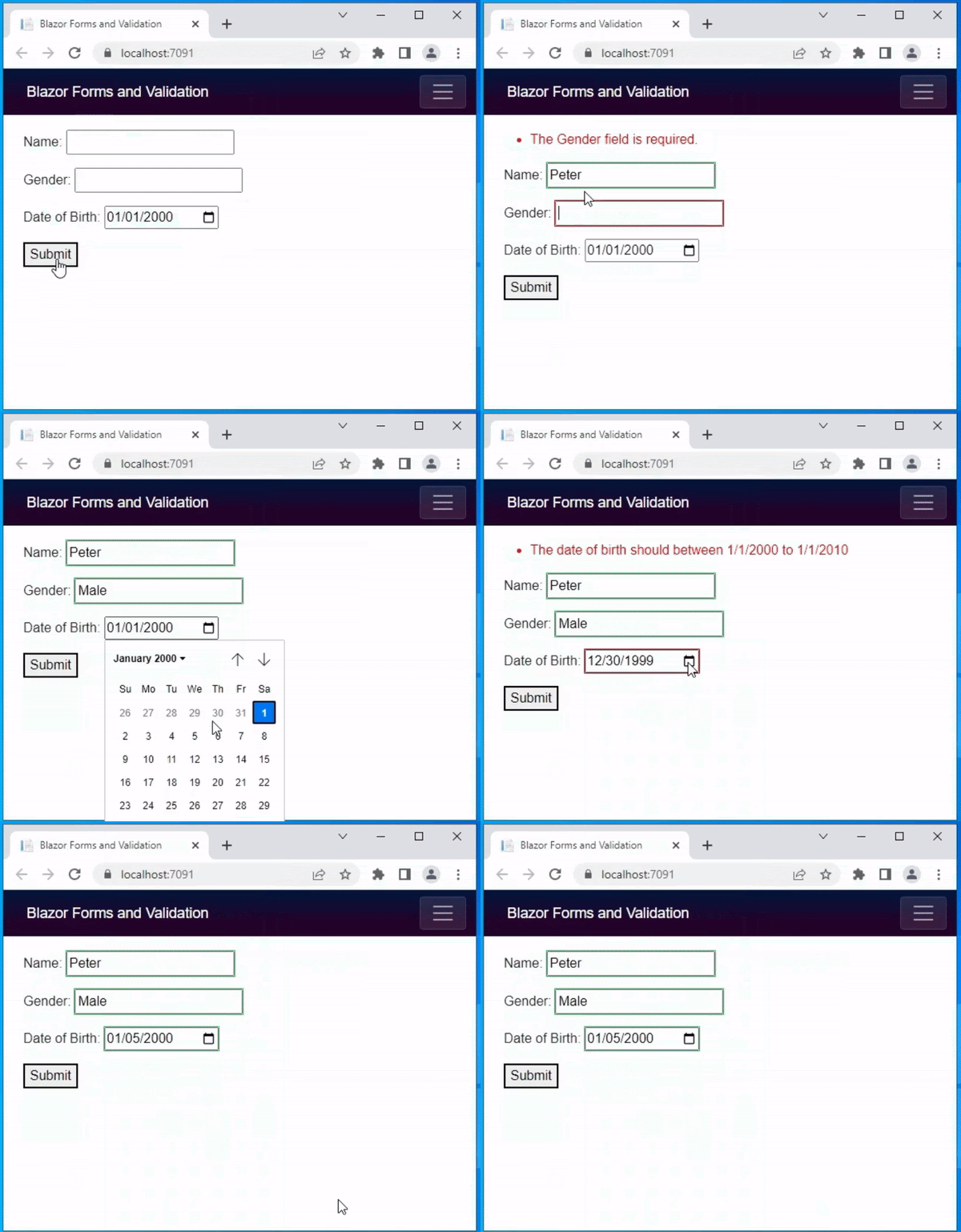
All of the class properties are marked with the [Required] attribute in this case. It specifies that the value of the data field is required. [MinLength(3)] attributes are assigned to the Name. It specifies the shortest string data allowed in name. The [Range] attribute is assigned to the DateOfBirth property. The range has been set to “1/1/2000” to “1/1/2010”. As a result, the date of birth should be between “1/1/2000” and “1/1/2010”. Also, the ErrorMessage property has been set, so if the user enters an invalid date of birth, the error message will be displayed.

Demo.cs
using System.ComponentModel.DataAnnotations;

namespace SampleBlazorApp.Data
{ 
    public class Student
    {
        [Required]
        [MinLength(3)]
        public string Name{ get; set; }
        
        [Required]
        public string Gender { get; set; }

        [Required]
        [Range(typeof(DateTime), "1/1/2000", "1/1/2010",
        ErrorMessage = "The date of birth should between 1/1/2000 to 1/1/2010")]
        public DateTime DateOfBirth { get; set; } = Convert.ToDateTime("1/1/2000");
    }
}

The code for a razor component is as follows. A form attribute is created by the EditForm element. It displays the form element. In the @code area, the student model is created. The student model is assigned the Model attribute in the EditForm component. As a result, it binds the student model to the form. The SaveData method is assigned to the EditForm‘s OnValidSubmit attribute. The SaveData  method will be executed if no validation errors occur. For example, if any of the input fields are empty, the validation summary will display the message like “The name field is required”. That means the validation process isn’t finished. The SaveData method is not called in such cases.

In the code below, an InputText component is added to add and edit string values. The InputDate component has been added to collect the date of birth value. The @bind-Value directive attribute aids in binding model values to the component value properties InputText and InputDate.

index.cshtml
@page "/"
@using SampleBlazorApp.Data

<EditForm Model="@student" OnValidSubmit="SaveData">
    <DataAnnotationsValidator />
    <ValidationSummary />

    <p>
        First Name:
        <InputText @bind-Value="@student.FirstName"></InputText>
    </p>
    <p>
        Last Name:
        <InputText @bind-Value="@student.LastName"></InputText>
    </p>

    <p>
        Gender:
        <InputText @bind-Value="@student.Gender"></InputText>
    </p>

    <p>
        Date of Birth:
        <InputDate @bind-Value="@student.DateOfBirth"></InputDate>
    </p>

    <p>
        Address:
        <InputText @bind-Value="@student.Address"></InputText>
    </p>
    <button type="submit">Submit</button>
</EditForm>

@code {
    private Student student = new Student();

    private void SaveData()
    {
        // data save code
    }
}

The following is the output of the above code. Here you can see that when the user clicks on the submit button it gives a summary error message. The error message disappears when the user enters the correct values.

blazor validation 1

Must True Validation

The user may be required to acknowledge something like ‘I accept the terms and conditions’ at times. If this is the case, the checkbox must be selected before submitting the form.  Let’s look at how to do that with data annotation validation.

A demo class file is provided below. It has two properties: Name and IsAccepted. The property IsAccepted must be true. So, the range validation attribute was used here. The data type bool has been specified. The minimum and maximum values are both set to “true.” If it is false, it means the user did not check the checkbox, and the error message will be displayed.

Demo.cs

using System.ComponentModel.DataAnnotations;

namespace SampleBlazorApp.Data

{
    public class Demo
    {
        [Required]
        [MinLength(2)]
        public string Name { get; set; }

        [Range(typeof(bool), "true", "true", 
            ErrorMessage = "Accept the terms and conditions")]            
        public bool IsAccepted { get; set; }
    }
}

The following is a razor page code. 

index.razor
@page "/"
@using SampleBlazorApp.Data

<EditForm Model="@demo" OnValidSubmit="SaveData">
    <DataAnnotationsValidator />
    <ValidationSummary />

    <p>
        Name:
        <InputText @bind-Value="@demo.Name"></InputText>
    </p>
    <p>
        <InputCheckbox @bind-Value="@demo.IsAccepted"></InputCheckbox> I accept the terms and conditions
    </p>

    <button type="submit">Submit</button>
</EditForm>

@code {
    private Demo demo = new Demo();

    private void SaveData()
    {
        // data save code
    }
}

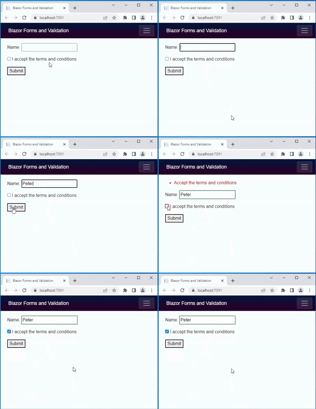
The image below is the result of the above code. The range validation is demonstrated here.

blazor validation 2

Validation for Specific Field

The preceding examples demonstrate how to display the error message in summary. However, if you want to display a specific error message, you can use the <ValidationMessage> component. The code below demonstrates the specific field validation. The <ValidationMessage> attribute has been added next to the Name and Age textboxes.

index.cshtml
@page "/"
@using SampleBlazorApp.Data

<EditForm Model="@demo" OnValidSubmit="SaveData">
    <DataAnnotationsValidator />

    <p>
        Name:
        <InputText @bind-Value="@demo.Name"></InputText>
        <ValidationMessage For="@(() => demo.Name)" />
    </p>
    <p>
        Age: 
        <InputNumber @bind-Value="@demo.Age" ></InputNumber>
        <ValidationMessage For="@(() => demo.Age)" />
    </p>

    <button type="submit">Submit</button>
</EditForm>

@code {
    private Demo demo = new Demo();

    private void SaveData()
    {
        // data save code
    }
}

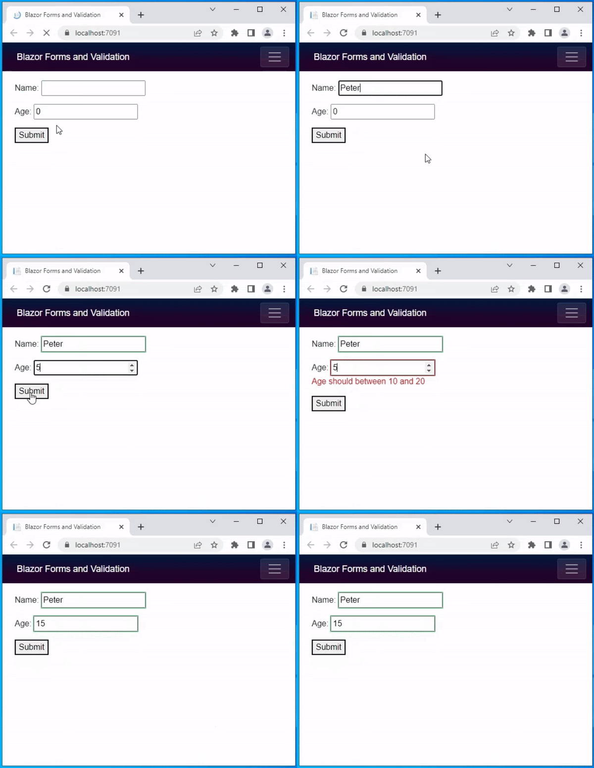
The above code produced the following result. When the user enters the age 5 here, the error message appears right next to the age textbox.

blazor validation 3

Handle Form Submission

To handle the form submission, the EditForm provide following callbacks

OnValidSubmit – This will call the assigned event handler when the user has entered all valid entries

OnInvalidSubmit – This will call the assigned event handler when the input value is no or any value is invalid

OnSubmit – This will call the assigned event handler whether the form is valid or not.

Built-in form component

The Blazer framework provides some built-in input components to obtain input values. The following is a list of built-in form elements

Input ComponentRendered Element
InputCheckbox<input type=”checkbox”>
InputDate<input type=”date”>
InputFile<input type=”file”>
InputNumber<input type=”number”>
InputRadio<input type=”radio”>
InputRadioGroupGroup of child InputRadio
InputSelect<select>
InputText<input>
InputTextArea<textarea>

Conclusion

From this blog you can understand how form and data annotation validation works in Blazor. Also, You can also find coding examples for various types of validation. I hope you find this blog useful.

Read our blog for valuable insights on Static Image in Blazor

Categories
ASP.NET Core

Blazor Cascading Values and Parameters

This blog is going to explain how to pass values from parent component to child component. A cascading parameter and component is an easy way to flow data from parent to child components.

Basic Cascading Parameter and Component

I have created two components to illustrate the data flow Parent.razor and Child.razor. The following is a parent component. I’ve added a textbox to collect the result and send it to the child component. Next, the <CascadingValue> component is added.

It passes the cascading value to all child components.

In this example, I’ve added a <Child> component inside a <CascadingValue> component . The result value is assigned to the value attribute of the <CascadingValue> element.

To explain that I have created two components. 

Parent.razor and Child.razor. The following one is a Parent component. 

Here I have added a textbox to collect a result to pass to the child component. 

Next, <CascadingValue> component is added. 

This passes the cascading value to all the child components. 

In this example I have added <child> component inside the <CascadingValue> component. The result  variable is assigned to the  Value attribute of the  <CascadingValue> component.

Parent.razor
@page "/Parent"

<h3>Parent</h3>

Result: <input type="text" @bind="@result" />
<br />
<br />
<CascadingValue Value="@result">
    <Child></Child>
</CascadingValue>

@code {
    int result = 10;
}

The next code snippet is the child component code.

A receivedResult property variable is added here to get the value from the parent component.

Added [CascadingParameter] attribute on top of receivedResult variable.

So the receivedResult will get the nearest parent <CascadingValue> value.

Child.razor
@page "/Child"

<h4>Child Component</h4>
<p>Result: <b>@receivedResult</b></p>

@code {
    [CascadingParameter]
    int receivedResult { get; set; }
}

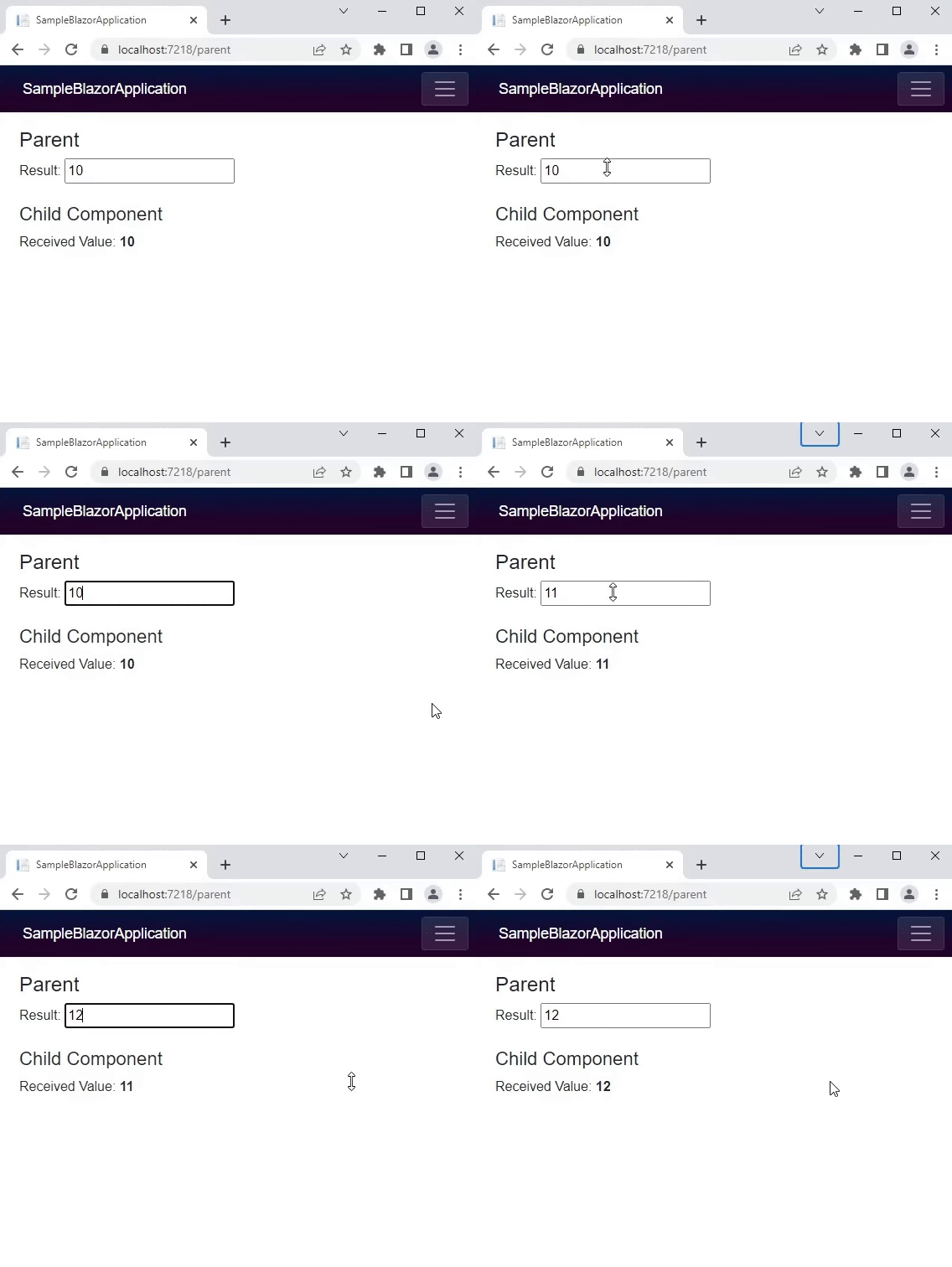
The following is a output of the above code samples

Blazor application

Cascade multiple values

Next, you’re going to see how to cascade multiple values ​​from the parent component to the child component.

In the parent component code below two text boxes have been added to collect the student name and age.

Name is String and Age is Numeric.

In the code below the child component is enclosed within two <CascadingValue> elements. One is to pass the student name and the other is to pass student age.

parent.razor
@page "/Parent"

<h3>Parent Component</h3>

Student Name: <input type="text" @bind="@stuName" />
 <br />
Age: <input type="text" @bind="@stuAge" />

<br /><br />

<CascadingValue Value="@stuName">
    <CascadingValue Value="@stuAge">
        <Child></Child>
    </CascadingValue>
</CascadingValue>

@code {
     string stuName = "Ed";
     int stuAge = 10;
}

The code below is the Child.razor code. Two property variables name and age are included with the [CascadingParameter] property. And the variables are displayed to show in the application.

Child.razor

@page "/Child"

<h4>Child Component</h4>

<p>Student Name: <b>@Name</b></p>
<p>Student Age: <b>@Age</b></p>

@code {
    [CascadingParameter]
    string Name { get; set; }

    [CascadingParameter]
    int Age { get; set; }
}

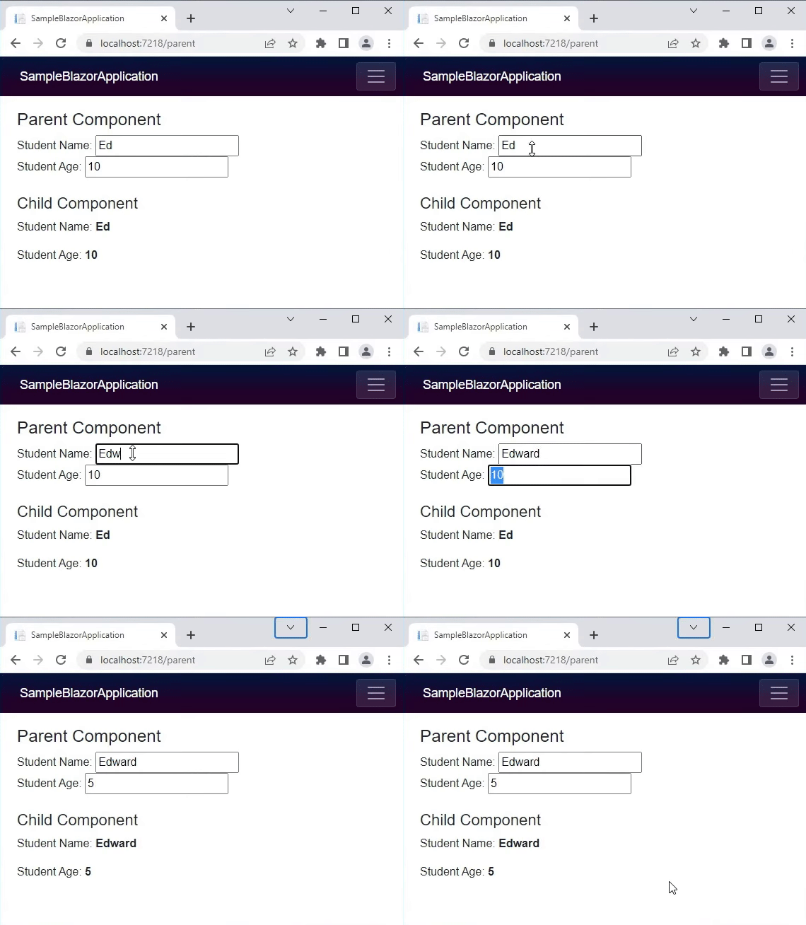
The below one is the output of above code.

Blazor Cascading Values and Parameters

Cascade multiple values by name

In the previous example, the cascading values ​​are different data types, one is string and the other numeric. But when you cascade the same data type, you need to set the name attribute in the <CascaddingValue> component. In the example below, the student name and favourite subject are assigned to the <CascadingValue> component. Here you can see that the name attribute is added to both the <CascaddingValue>

@page "/Parent"

<h3>Parent Component</h3>

Student Name: <input type="text" @bind="@studentName" />
<br />
Favourite Subject: <input type="text" @bind="@subject" />

<br />
<br />

<CascadingValue Value="@studentName" Name="name">
    <CascadingValue Value="@subject" Name="sub">
        <Child></Child>
    </CascadingValue>
</CascadingValue>

@code {
    string studentName = "Ed";
    string subject = "Maths";
}

The below one is the child component. Here you see the Name is added in     [CascadingParameter]. So based on this Name the cascading values will get bound.

@page "/Child"

<h4>Child Component</h4>

<p>Student Name: <b>@Name</b></p>
<p>Favourite Subject: <b>@Subject</b></p>

@code {
    [CascadingParameter (Name = "name")]
    string Name { get; set; }

    [CascadingParameter (Name = "sub")]
    string Subject { get; set; }
}

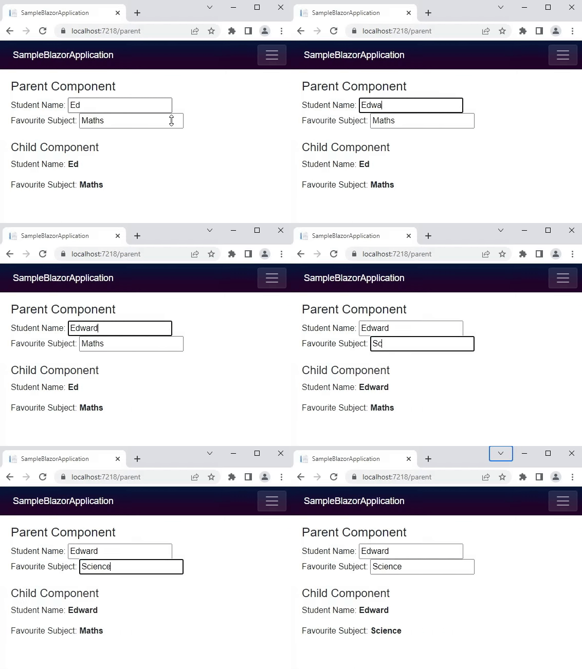
The following is an output of the above code.

blazor cascading parameters

Conclusion

This is how the Cascading Values and Parameters provide an easy way to send data down a component hierarchy from a parent component to any number of child components

Categories
ASP.NET Core

Data Binding in Blazor

Data binding is one of the most important processes in an application. Data binding is achieved through the @bind attribute in the Blazor component.

@bind attribute

The following code is an example of data binding to a textbox. This is a Blazor component code, so it contains the HTML tag and @code block in a file. Here the TextValue property value is assigned to the @bind attribute. The property value TextValue will update when the textbox loses focus. To display the updated value, the TextValue  will be displayed within the strong tag.

@page “/”

<h4>Data Binding</h4>

<input @bind=”TextValue” />

<br />
<div>
    <span>The Textbox value is: </span> <strong>@TextValue</strong>
</div>

@code {
    private string TextValue { get; set; }
}

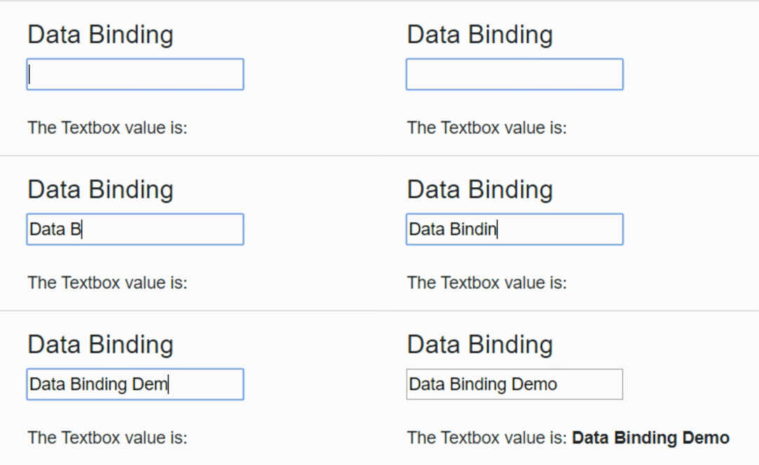
The following is the output of the above code. Here you can see how the values are updated when the textbox loses its focus.

Data Binding in Blazor example 1

@bind:event attribute

The code below is the same as the code above. But it has @bind:event in input element. In the previous example, the textbox element updates the property variable when it loses focus. But in this example it is updated at the time of typing text using the @bind:event.

@page “/”

<h4>Data Binding</h4>

<input @bind=”TextValue” @bind:event=”oninput” />

<br />
<br />
<div>
    <span>The Textbox value is: </span> <strong>@TextValue</strong>
</div>

@code {
    private string TextValue { get; set; }
}

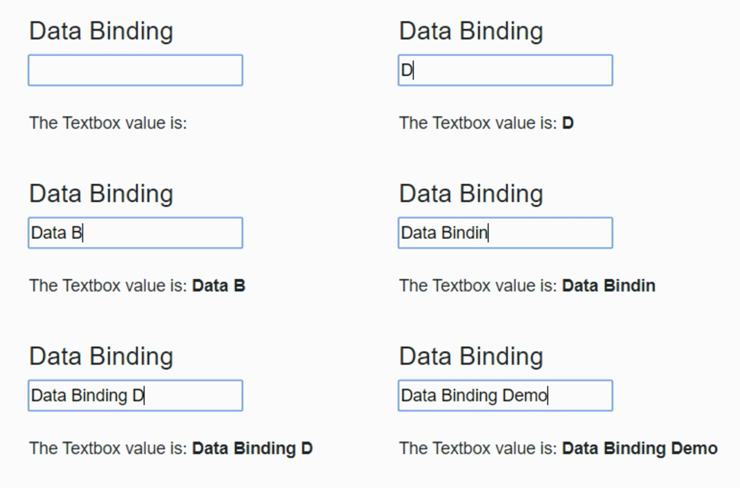
The following is the output of the above code. Here you can see how the values are updated when typing the text in the textbox.

Data Binding in Blazor example 2

@bind-{ATTRIBUTE} and @bind-{ATTRIBUTE}:event attributes

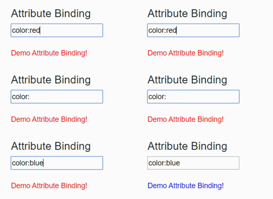
@bind-{ATTRIBUTE} and @bind-{ATTRIBUTE}:event helps bind the attributes. In the code below @bind-style and @bind-style:event attributes are added to the div tag. So when you set the style attribute in the textbox it will change into the div element.

@page “/”

<h4>Attribute Binding</h4>

<input type=”text” @bind=”StyleValue” />

<br />
<br />

<div @bind-style=”StyleValue” @bind-style:event=”onchange”>
    Demo Attribute Binding!
</div>

@code {
    private string StyleValue = “color:red”;
}

The following is the output of the above code. Here you can see how the div content color changes when changing the color name in the textbox.

Data Binding in Blazor exmple 3

This article explains how the @bind attribute binds value in the blazer.

If you have any questions please comment below.

Categories
ASP.NET Core

Route Templates in ASP.NET CORE Blazor

The term routing in Blazor is moving or navigating between the Blazor components. The Blazor provides a client-site routing mode. In this blog, let us see what is Route Templates in ASP.NET CORE Blazor.

In the Blazor application, the Router component is present inside the App.razor file.

The following is a default Router Component.

<Router AppAssembly=”@typeof(Program).Assembly“>
    <Found Context=”routeData”>
        <RouteView RouteData=”@routeData DefaultLayout=”@typeof(MainLayout) />
    </Found>
    <NotFound>
        <LayoutView Layout=”@typeof(MainLayout)“>
            <p>Sorry, there’s nothing at this address.</p>
        </LayoutView>
    </NotFound>
</Router>

The Router component will provide the route data to the RouteView from the current navigation site. When matching is found for the requested route, the RouteView Component will populate the specified component inside the layout. If the requested route is not found, then the NotFound component will populate the content. From the above code it will display “Sorry, there’s nothing at this address.” message. Also, the user can customize the content for their needs.

Route Template

The Route Template is defined by adding the @page directive at the top of the component. @page directive will convert into RouteAttribute at the time of compiling the code. In the below snippet, the @page directive added as @page “/”. So when accessing a URL, say https://www.domainname.com/ it will display the component

@page “/”
<h1> Hello, Blazor!</ h1>
Welcome to your Blazor App lication.

https://www.domainname.com/index URL will display the below component.

@page “/ index
<h1> Hello, Index Page!</ h1>
Welcome to Index Page.

Multiple Route

A single component may have multiple route templates. Consider the following component. Here, two different @page directives are stacked in the file. So it will provide multiple routes to the same component.

@page  /BlazorRoute
@page  /AnotherBlazorRoute
<h1> Blazor Multiple Routing</h1>

https://www.domainname.com/BlazorRoute and https://www.domainname.com/AnotherBlazorRoute both URLs will display the same above component

Route parameters

@page “/BlazorRoute”
@page “/BlazorRoute/{ParameterText}”
@if  (string.IsNullOrWhiteSpace(ParameterText))
{
    <h1 >Blazor Route Without Parameter</h1 >
}
else
{
    <h1 >Blazor Route With Parameter: @ParameterText </h1>
}
@code {
    [Parameter]
    public  string ParameterText { get set; }

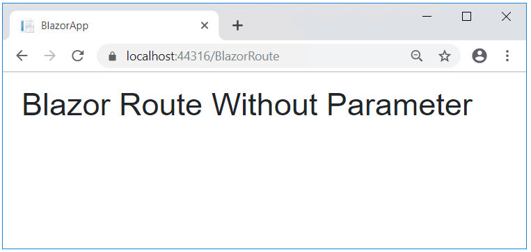
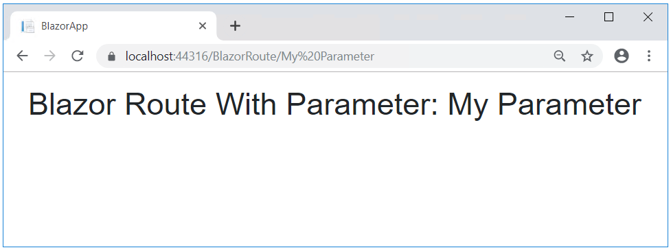
In the above code snippet, two @page directives are added. The first directive is to navigate without parameter and the second one is to navigate with parameter. The parameter is defined with curly brackets. [Parameter] attribute has been added to the ParameterText property variable to denote it as a component parameter.

https://localhost:44316/BlazorRoute/ will give the following output:

Blazor Route without Parameter

https://localhost:44316/BlazorRoute/My%20Parameter this URL will provide the following output.

Blazor Route with Parameter

Route constraints

@page “/BlazorRoute/{ID:int}/{TextParameter}”
<h1> The given integer value is @ID</ h1>
<h1> The given text parameter value is @TextParameter </h1>
@code {
    [Parameter]
    public  int ID { get set; }
    [Parameter]
    public  string TextParameter { get set;}
}

The above code snippet illustrates how to pass multiple parameters and route constraints. The ID parameter solely accepts the integer value[{ID:int}]. And the TextParameter will accept the string value. The following image is an output of the above code. https://localhost:44316/BlazorRoute/5/my%20parameter

Blazor Route constraints

The user needs to pass both ID and TextParameter parameters otherwise the output will show the message with the NotFound Component.

If you have any questions, please leave a comment.

Categories
ASP.NET Core

Basic Event Handling in Blazor

This article is to explain how event handling works in Blazor. The @on{event} attribute in Razor is the event handling attribute. The {event} may be any event. For example, For button @onclick is a click event. In checkbox @onchange is a change event it will trigger, when checking or unchecking the checkbox.

The following is an example for @onclick. In this code, the @page directive is added for routing. Then @result property value is added to display the result. Then the @onclick attribute is added to the button and the DisplayMessage method is assigned to it. When the user clicks the button it will display the message.

@page “/”

<div>@result</div>

<br />
<button @onclick=”DisplayMessage”>Click Here</button>

@code
{
    public string result { get; set; }

    void DisplayMessage()
    {
        result = “The button is clicked”;
    }
}

The following is an output of the above code.

Event Handling

Lambda Expressions

You can achieve the same result as above using lambda expressions.

@page “/”

<div>@result</div>

<br />
<button @onclick=”@(e=>DisplayMessage())”>Click Here</button>

@code
{
    public string result { get; set; }

    void DisplayMessage()
    {
        result = “The button is clicked”;
    }
}

Also, you can pass arguments to the @onclick method using the Lambda expression.

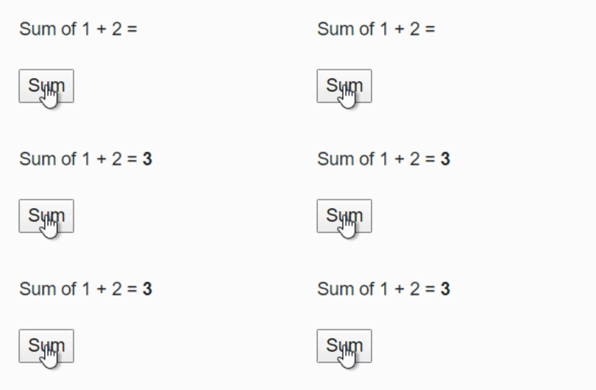
The following code explains how to pass arguments. Here in GetSum() method two arguments a and b are passed.

@page “/”

Sum of 1 + 2 = <strong>@result</strong>

<br /><br />
<button @onclick=”@(e=>GetSum(1, 2))”>Sum</button>

@code
{
    public int? result { get; set; }

    void GetSum(int a, int b)
    {
        result = 1 + 2;
    }
}

The following is an output of the above code.

Event Handling

This article explains what is event handling in Blazor and how to pass parameters to an event handler.

If you have questions, please leave your comments.

Categories
ASP.NET Core

Turn on CircuitOption.DetailedError in Blazor

This article is going to explain how to enable CircuitOption.DetailedError in the development environment.

Let us look at a small example. The following is the Blazor component code. It contains both HTML and @code block. GetArray() method is defined in the @code module. In it, the array is initialized with four elements.  Finally, arr [5] is assigned to the result variable so that it triggers an index outside the range exception.

@page “/”

<h4>Turn on CircuitOption.DetailedError</h4>

<button @onclick=”GetArray”>Trigger the Exception</button>

@code
{
    void GetArray()
    {
        int[] arr = new int[] { 1, 2, 3, 4 };
        int result = arr[5];
    }
}

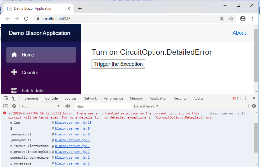
The following screenshot illustrates how the exception is displayed in the browser. It states, Error: There was an unhandled exception on the current circuit, so this circuit will be terminated. For more details turn on detailed exceptions in ‘CircuitOptions.DetailedErrors’.

CircuitOption.DetailedError

Let us see how to enable the CircuitOption.DetailedError.

In the Startup.cs file, IWebHostEnvironment  is initialized to provide web hosting environment information. Added  IWebHostEnvironment  in Startup constructor. Finally, AddCircuitOptions has been added in the ConfigureServices method, which helps to configure circuits.

In this code _Env.Is Development () is checked to confirm if it is a development environment or not. If it is a development environment, then only it will display the detail error.

private readonly IWebHostEnvironment _env;

public Startup(IConfiguration configuration, IWebHostEnvironment env)
{
    Configuration = configuration;
    _env = env;
}

public void ConfigureServices(IServiceCollection services)
{
    services.AddRazorPages();

    services.AddServerSideBlazor().AddCircuitOptions(options => {
       if (_env.IsDevelopment())
      {
        options.DetailedErrors = true;
      }
    });

    services.AddSingleton<WeatherForecastService>();
}

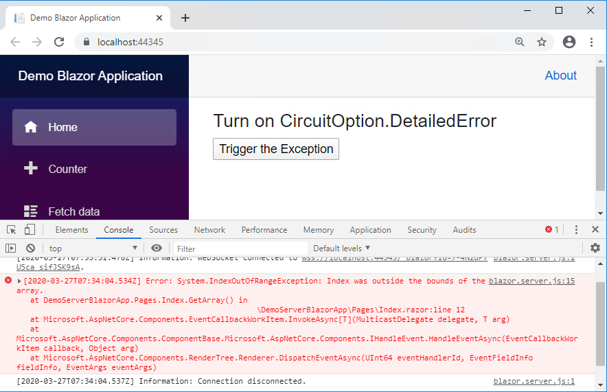
The following screenshot illustrates how the browser displays the error after enabling a detailed error. It clearly states what the error is and shows which file it is and which line number it occurs.

CircuitOption.DetailedError in Blazor

The blog explains how to enable CircuitOption.DetailedError in the development environment.

If you have any questions, please leave a comment.

Categories
Technology

Static Image in Blazor – Inside and Outside Web Root

This article explains how to display a static image in the Blazor component. In ASP.NET Core  static files are served by Microsoft.AspNetCore.StaticFiles middleware. First, let’s look at the general way to display the image in the Blazor component.

Inside the Web Root

To display a static image in the Blazor component, first, it must store the image in any folder under the wwwroot file. It can be accessed by the relative path. To serve a static image, you need to use the app.UseStaticFiles () method in the start.Configure file.

The following is the Blazor component code. Here the image is obtained from {applicationFolder} /wwwroot/Image/InsideWebRoot.png.

@page “/”
<h3> Display Image in Blazor</h3>
<div>
    <img  src=”/Image/InsideWebRoot.png”   />
</div>
@code {
}

Outside the Web Root

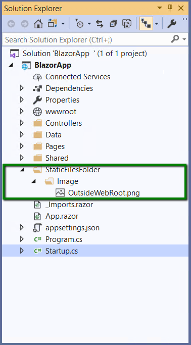
The static file can also be served outside the web root. Consider the following image, here the StaticFilesFolder/Image is created outside the wwwroot folder.

Static Image

To serve this, you first need to configure the UseStaticFiles () method in the Startup.cs file. In the following code, UseStaticFiles uses FileProvider to locate the static file. PhysicalFileProvider is used to access the physical path. The request path is set to “/staticFiles”, which is mapped to the static file.

public void  Configure(IApplicationBuilder  app, IWebHostEnvironment env)
{
    app.UseStaticFiles();
 
    app.UseStaticFiles( new StaticFileOptions
    {
FileProvider = new  PhysicalFileProvider(
       Path. Combine(Directory . GetCurrentDirectory(), “StaticFilesFolder” )),
RequestPath = “/StaticFiles”
    });
}

The following is the Blazor component code. The static image path in the img tag is assigned as “/StaticFiles/Image/OutsideWebRoot.png”. The /StaticFiles is a RequestPath that is configured in the startup.cs file. So the following code will show the static image that is outside the web root.

@page “/”
<h3> Display Image in Blazor</h3>
<div>
    <img  src=”/StaticFiles/Image/OutsideWebRoot.png”  />
</div>
@code {
}

This article explains how to display a static image in Blazor Component.

If you have questions, please leave a comment.